Marown Waymarker
The final prop I wanted to create was the Marown marker. Within my proposed animation, the church roof would land behind the marker, clearly showing the audience where it had been thrown.
I began by researching how places might have been marked around the period in which the story is set. I could not find clear evidence that a marker like this would have existed in twelfth-century Isle of Man, so I decided to use artistic licence. The result should therefore be understood as a stylised narrative prop rather than a historically accurate reconstruction.
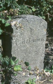
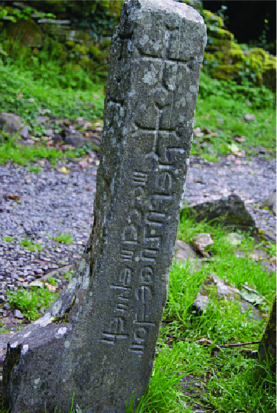
I found a reference image of a carved stone place marker that provided a useful starting point. Using this as a guide, I shaped the marker from clay and deliberately left some of the marks and scratches visible so they would remain after painting.
For the lettering, I selected a digital typeface influenced by Celtic and insular carving. As with the paper props, I printed the lettering at the required size and used it as a stencil. I also wanted to include a simple cross inspired by the visual language of carved stones found across the Isle of Man.
I placed the printed design over the clay and pressed lightly with a pencil through the paper to leave an impression. I then used clay-carving tools to refine the letters and cross.
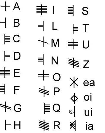
The main place name was written in English so that it could communicate clearly to the viewer during a short scene. I also experimented with adding a second inscription inspired by Ogham.
Ogham is a distinct writing system found on a number of early Manx carved stones. It uses groups of lines arranged around an edge or central stem rather than functioning as a decorative Gaelic version of the English alphabet. My attempt to represent “Maron” was based on a limited visual reference, so it should be treated as a stylised experiment rather than an accurate historical transliteration.
Once the carving was complete, I baked the clay and allowed it to cool before painting. I started with a dark grey base and gradually added lighter layers to bring out the surface texture. I filled the main lettering with black to improve its legibility when viewed through the camera.
You can see the making and painting process in the video below.
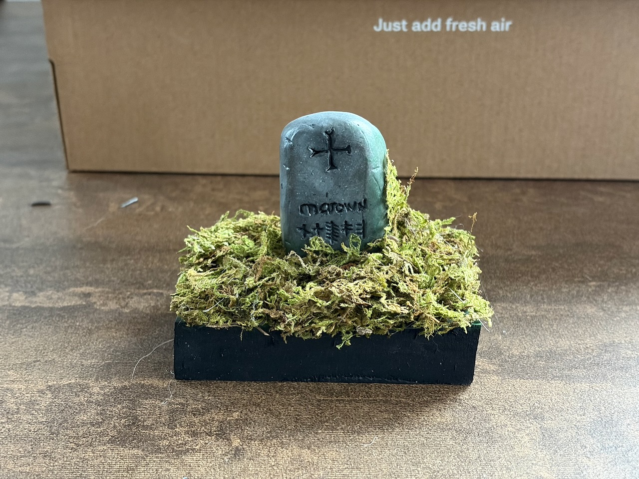
As with the Official Notice of Complaint, I wanted to create a small environment in which the prop could be photographed. I painted a spare piece of foam as the base and marked out the position of the stone. I then attached real sphagnum moss using hot glue, building it up around the marker to suggest grass and other vegetation.
The finished diorama gives the marker a physical context and helps it feel like part of the same handmade world as the other outcomes. I am particularly pleased with the way the moss climbs around the clay surface and softens the edge between the prop and its environment.