Plan for the Week
Define the core visual language and colour palettes for the film
Establish texture references for the contrasting environments
Generate 2D concept art to serve as visual development for the pitch package and animatic
Visual Direction: Reversing Expectations
This week is focused on developing the visual direction of the project. Before I start building any of the puppets or hero props, I need to establish how the world of St Trinian’s might look and create some visual references to work from.
The story relies on the contrast between the Buggane’s surprisingly refined personality and the monks’ miserable building work. I want to carry this contrast into the colour and materials. A monster’s cave would normally be cold and threatening, while a church might be shown as warm and welcoming. For this film, I want to reverse those expectations.
Colour Palettes & Texture References
I have divided the visual research between the two main locations, giving each one its own colour palette, materials and atmosphere:
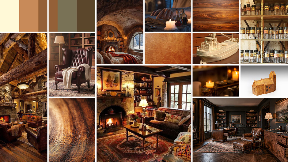
The Buggane’s Cave (Underground)
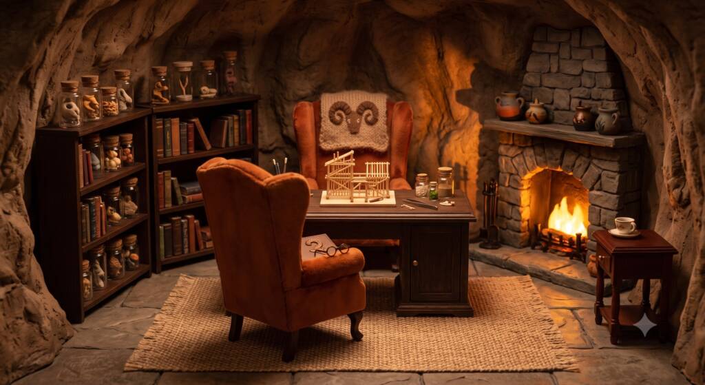
Colour Palette: Warm, rich, and inviting. Deep mahogany browns, warm amber candlelight, and plush jewel tones (like a burgundy wingback chair or gold accents).
Textures: Smooth, refined materials. Polished woodgrain, heavily distressed leather, delicate glass apothecary jars, and the intricate, mathematical precision of the matchstick models. The lighting here will be soft and symmetrical.
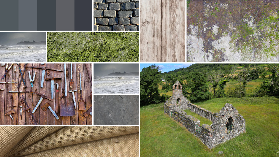
St Trinian’s Church (The Surface)
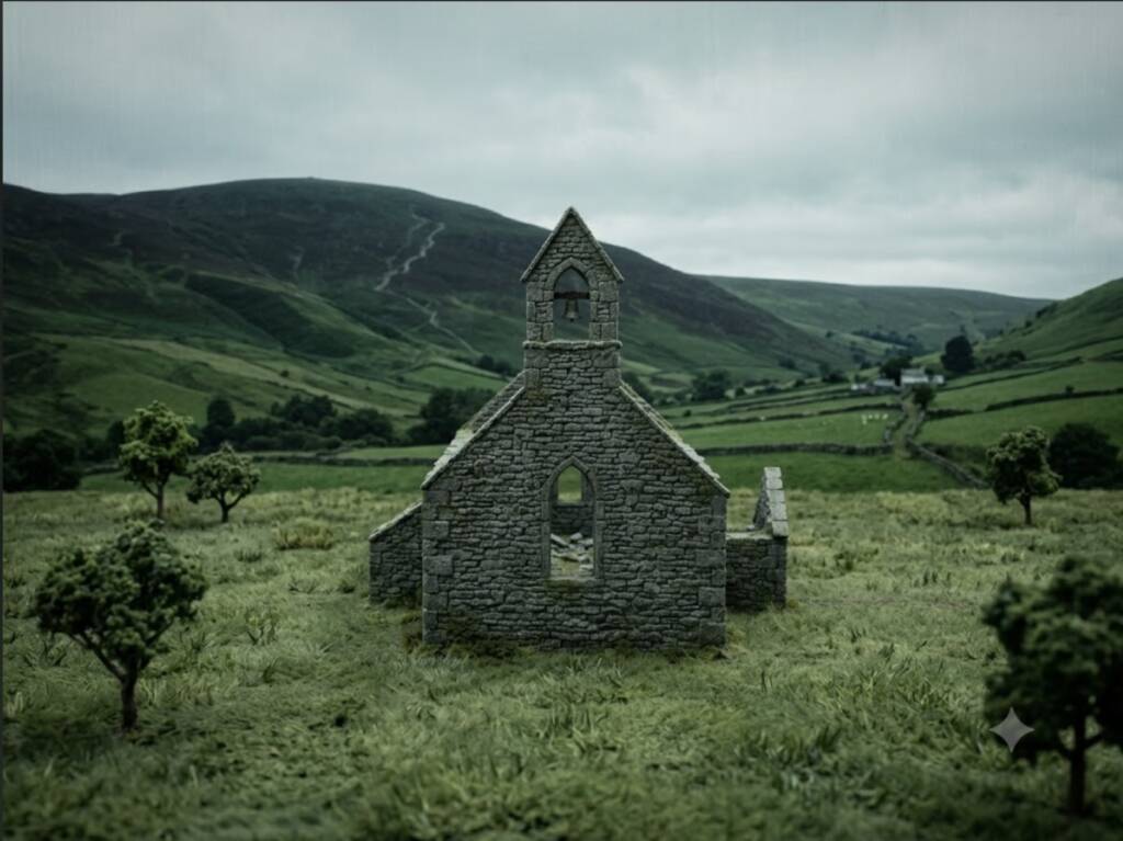
Colour Palette: Cold, damp, and miserable. Heavy slate greys, washed out earthy greens, and muddy browns. This reflects not only the traditional Isle of Man weather but also the sheer exhaustion of the monks.
Textures: Rough, abrasive materials. Coarse wool for the monks’ robes, damp moss, rough hewn granite, and rusted iron tools. The lighting will be harsh, flat, and overcast.
Concept Art Generation
With the basic colour and texture rules established, I moved on to producing some initial concept images. These will help me communicate the intended direction of the proposed film in my Studio Practice PDF and give me something visual to refer back to when I begin making the physical assets.
Although I can sketch reasonably well, I decided to experiment with using AI to develop rendered concept images from my initial drawings and written prompts. I’m still unsure about the use of AI within creative projects, so I don’t want to present these images as finished design work. Instead, I’m using them as a quick visualisation tool to test composition, colour and atmosphere before producing anything physically.
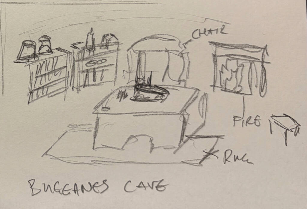
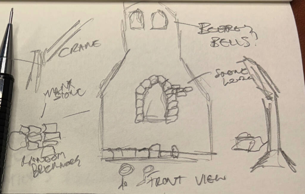
Below, I have included my original sketch followed by the AI-assisted result. Starting with my own drawing gave the generated image more visual direction than relying entirely on a written prompt, although I still had to review the results and decide which elements were useful to the project.
I tried to focus on some of the visual principles I had identified in Wes Anderson’s work, particularly frontal viewpoints, symmetry, controlled colour palettes and compositions that resemble small theatrical sets.
Generation One: The Buggane’s Lair (Cross-Section)
This image frames the cave straight on, almost like a doll’s house. The armchair sits near the centre, surrounded by bookshelves and the Buggane’s proposed matchstick-modelling table. It gives me an idea of how much miniature furniture and set dressing might be needed to make the environment feel lived-in if I decide to produce this part of the set.
Generation 2: The Church Construction (Flat Elevation)
This is a wide, symmetrical view of the partly constructed church. I included an oversized wooden crane and placed the exhausted monks in the foreground. The image is not detailed enough to give me exact measurements, but it helps me begin thinking about the scale of the environment in relation to the proposed character puppets.
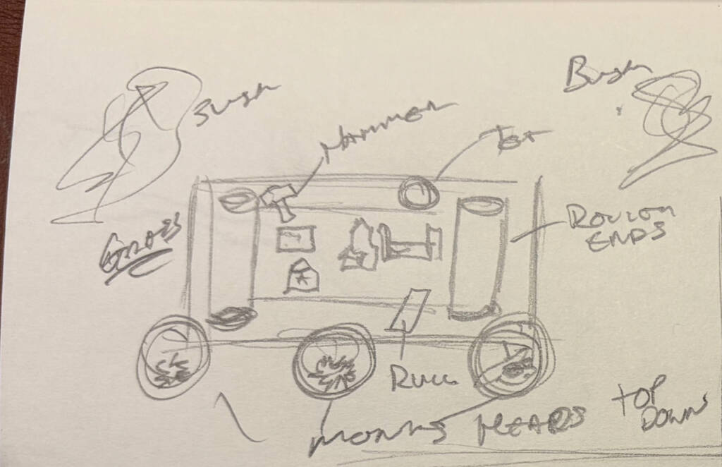
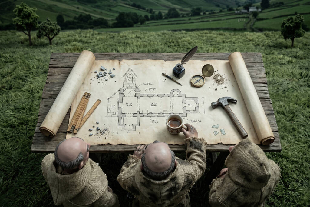
Generation 3: The Architectural Plans Table (Top-Down)
This image explores the opening sequence involving the monks, viewed directly from above. It begins to map out where the main props, including the hand-drawn architectural plans and small tea mugs, could be positioned within the frame. It also gives me a useful reference for the aged paper, ink and other tactile details I may need to produce.
Looking Forward
Producing these sketches and concept images has helped me establish a more consistent tone and colour palette for the project. When I begin constructing the assets, I will have some visual references to work from rather than designing everything during the making process. They do not give me exact proportions or measurements, but they provide a useful starting point for deciding what needs to be made and how the different objects might work together.