

Secondary Research Methods
Literature Reviews – Analysing foundational texts on graphic prop design, such as Annie Atkins’ Fake Love Letters, Forged Telegrams, and Prison Escape Maps, alongside any academic texts on typography and visual culture I may be able to find
Online Design Articles – Reviewing industry write-ups, practitioner interviews, and design showcases (e.g., AIGA Eye on Design, Creative Review, and It’s Nice That) focusing on graphic props in both cinema and live theatre
Film & Media Reviews – Examining mainstream and academic film reviews that specifically comment on the success of a production’s world-building, noting when props are singled out for praise.
IMDb ‘Goofs’ and Trivia Databases: Using publicly submitted examples as possible starting points for identifying graphic anachronisms. As these entries are user-generated, I will verify relevant claims against reliable historical, archival or typographic sources before treating them as evidence.
Narrative Theory Research – Delving into academic journals via Google Scholar to research psychological concepts like “Suspension of Disbelief” and “Narrative Transportation Theory”
Literature Reviews
Book One
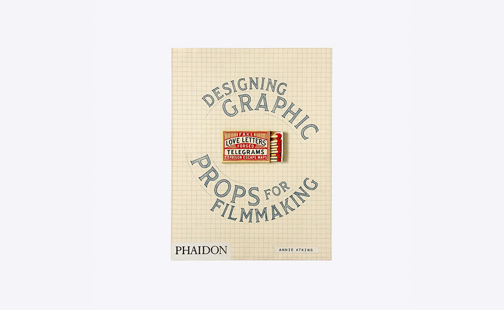
Annie Atkins – Fake Love Letters, Forged Telegrams, and Prison Escape Maps: Designing Graphic Props for Filmmaking
ATKINS, A. (2020) Fake Love Letters, Forged Telegrams, and Prison Escape Maps: Designing Graphic Props for Filmmaking. London: Phaidon Press.
Annie Atkins has been a practitioner I have looked up to since I was lucky enough to attend one of her short workshops a few years ago. Since discovering her talks, I’ve deeply admired her passion and her work. The book dives deeply into the concept of designing for two completely different audiences: the camera lens and the human hand. Annie explains that a graphic prop designer’s job is a bit of a trick, because you are trying to make a brand-new object look and feel like it has survived for decades. She talks about how she spends hours sourcing genuine vintage paper stocks, mixing specific inks, and manually wearing down edges with sandpaper or tea staining. All of this intense labour is done knowing full well that a modern high-definition camera will capture the exact way light hits a physical texture.
“If a prop is just a flat digital print on modern paper, the camera exposes the lie instantly.”
By treating the prop as a physical, tactile artifact, it completely changes how the actors interact with it on set, allowing their performance to feel much more grounded and believable.
“We have to design for the lens, but we also have to design for the human hand.”
In relation to my project, Atkins’ work demonstrates the importance of considering a prop as a physical object rather than only as an image. Paper, ink, weight and signs of handling can all affect how an object appears through the camera and how it is used on set. This supports my decision to include material prototyping, although it does not mean that physical construction will automatically create narrative immersion.
Book Two

Ross MacDonald & Steven Heller – Prop Man: A Property Master’s Journey Through the History of Film and Television
MACDONALD, R. and HELLER, S. (2023) Prop Man: A Property Master’s Journey Through the History of Film and Television. New York: Princeton Architectural Press.
Ross MacDonald is another master practitioner who has led a bit of a double life as a print illustrator and a secret prop designer for over a hundred films and TV shows. His book Prop Man, which features interviews with the legendary design critic Steven Heller, tackles the incredibly precise, bureaucratic side of graphic props. He is the guy responsible for the historical documents in National Treasure and the gritty, vintage police files in Boardwalk Empire. While Annie Atkins focuses a lot on the whimsical, aesthetic side of cinema, MacDonald’s work is all about rugged, functional authenticity. He explains how a single forged passport or a legal land deed has to look so undeniably real that it can withstand a massive, high-definition close-up where the plot literally hinges on the text.
“Discover the secret history of the books, cards, letters, maps, and legal papers that play central and supporting roles…”
For my research, this book expands the discussion beyond obvious hero props. Ordinary documents can communicate information about a setting, institution or character even when they are not the main focus of a scene. It encourages me to consider both prominent props and quieter background material, while still judging how much detail is appropriate for the way each object will be photographed.
Book Three
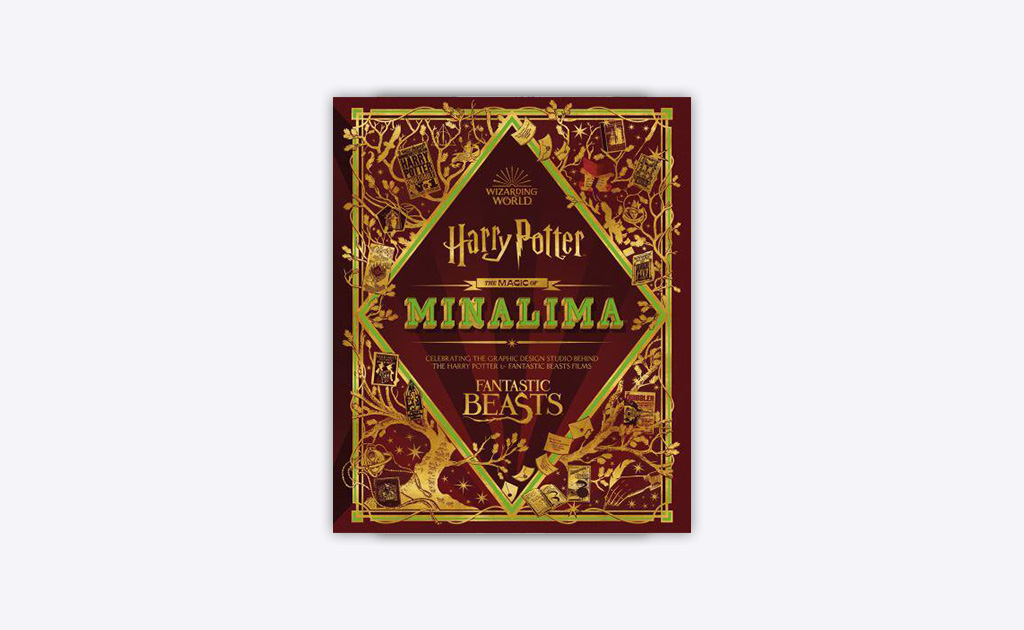
Miraphora Mina & Eduardo Lima – The Magic of MinaLima: Celebrating Modern Design, Storytelling and the Wizarding World
MINA, M. and LIMA, E. (2022) The Magic of MinaLima: Celebrating Modern Design, Storytelling and the Wizarding World. London: HarperDesign.
Even though I am not personally a massive fan of the Harry Potter movies, you absolutely cannot talk about graphic props without looking at the work of Miraphora Mina and Eduardo Lima. Their book, The Magic of MinaLima, chronicles their twenty-year journey creating the entire visual identity of the Wizarding World—from the iconic Hogwarts acceptance letters to the chaotic layouts of the Daily Prophet newspapers. The book is a massive celebration of how graphic design can create an entirely bespoke, alternative reality. They go into deep detail about establishing the strict ‘in-world’ typographic rules and visual boundaries that keep a fantasy setting feeling completely grounded and believable to the viewer.
“Their wondrous creations illuminate the Wizarding World as never before, and their commentary offers insights into the imaginative thinking that shaped their designs.”
For my research, MinaLima provides a useful contrast to designers working within recognisable historical settings. Their work shows how references to real printing, lettering and publishing can be adapted to create a fictional visual system. Internal consistency appears important here, although it is only one element of the audience’s engagement with the wider story.a
Online Articles & Videos
Item One
Adam Savage’s Test – What’s Wrong With These Products? – YouTube
YouTube (2023). What’s Wrong With These Products? [online] Www.youtube.com. Available at: https://www.youtube.com/watch?v=ushxeygqreq
Adam Savage has been a person of interest to me for years, his time on Mythbusters all the way to his YouTube channel ‘Adam Savage’s Tested’, I have always enjoyed watching him talk about his passion for tv and film props. In this video he is speaking with historian Michael Corrie from Earl Hayes Press about background and filler movie and tv props. This warehouse is filled with props and items that look enough like the real product to be believable in the background. He talks about how production teams very rarely like to use real life brands and packaging in production due to any legal issues arising from the brands themselves. All the items shown in the video are what is know as ‘cleared’ for use, meaning they are far enough away visually from real world branding that they don’t require any legal permissions or royalties.
“It’s a more thorny problem graphically to make something feel like it’s right, when it’s not, to get this close, from a graphic design standpoint, each one of this is a graphical challenge”
The video goes through a large variety of different ‘fake’ products used in film. One of the most interesting being ‘Morley’ Cigarettes, made to look similar to the real world brand Marlborough. Michael explains that he believes it is the most used ‘fake’ brand in filmmaking history, having been used in over 8,000 productions, looking back the fake product has even changed over time to keep in touch with the real brand, even down to slightly shifting the tone of the red used on the box when Marlboro did. All of this work and design, although it is basically copying a real product to get past legal hurdles, all of this shows it really has to be believable to the viewer. So much so that they almost have to get to a point where the viewer doesn’t notice that a fake product is being used, because the design of the prop so closely matches something the viewer already knows and is familiar with, that it just fades into the scene or the background, even when the prop is being physically used by the actor.
“As the viewer of film, you look at something on screen and you look at a pack of cigarettes, you know what a pack of cigarettes is supposed to look like, you know theres a tax stamp on it, you don’t pay any attention to it, but that level of effort they put into this instantly sells it to the movie goer, that it’s a real thing, when it’s 100% fake.”
For my project, the video demonstrates how fictional products can borrow familiar visual conventions without reproducing an existing brand exactly. Viewers may not consciously inspect every detail, but recognisable features such as packaging structure, labels and regulatory information can help an object read quickly on screen. It also introduces the practical issue of clearance, which is separate from historical accuracy but still affects how film graphics are designed.
Item Two
Weathervane Playhouse – The Immersive Function of Theatre Props
WEATHERVANE PLAYHOUSE (2026) The Immersive Function of Theatre Props. 18 March. Available at: https://weathervaneplayhouse.org/the-immersive-function-of-theatre-props/
This article looks at the exact role and execution of props, but from the perspective of live theatre rather than film. It breaks down how on-stage items are completely necessary for creating a deep sense of immersion and transportive realism for an audience watching a live performance. The piece talks about how a prop’s job goes far beyond just looking aesthetically pleasing; it actually has to actively drive the narrative, establish the location, and communicate massive chunks of character backstory—like a character’s social status or emotional state—without a single line of dialogue being spoken. It outlines the three major principles that make a prop successful: its style, its “read” (how well it can be seen and understood from the audience’s seats), and its mechanical function on stage.
“If used correctly, props sort of blend into the scene to make it more realistic and eye pleasing, to help transport the viewer into the time and place. If misused, you risk breaking the blur you’ve created between actor and audience member.”
What stood out to me was the discussion on how a prop can completely shatter the illusion if it is handled or built incorrectly. In theatre, because there are no camera edits or digital fixes, the object is completely exposed in real time. The article mentions that when a prop is completely coherent to the style and time period of the show, it creates a visual sense of the plot that allows the audience to comfortably “connect the dots” and feel things like suspense or surprise. But the moment an object feels out of place or malfunctions, that delicate blur between the actor and the audience member instantly snaps.
“A great prop cannot save a mediocre scene, but a bad prop can ruin a great one”
Theatre provides a useful comparison with film because props must be readable from a distance and function reliably in real time. Film props may instead be exposed through close-ups and repeated viewing. In both cases, the object needs to suit the performance, setting and visual style. This suggests that there is no single standard of detail: the design should respond to how the audience will encounter the prop.
Item Three
GoVisually Blog – Visual Storytelling: How Graphic Design In Film Is Used
KHAN, A. Z. (2021) Visual Storytelling: How Graphic Design In Film Is Used. GoVisually Blog, 25 November. Available at: https://govisually.com/blog/visual-storytelling-how-graphic-design-in-film-is-used/
This article investigates how graphic design serves as an absolute core component of visual storytelling inside the modern film and television industry. It explores how a film graphic designer’s job goes way beyond just making the promotional posters or marketing material you see outside the cinema. Instead, they are an integral part of the main crew, working directly within the art department to design everything from store display packaging to the exact newspaper a character holds in their hands. The text focuses heavily on the idea that expertly designed graphic components are what tie a film’s atmosphere together, making the audience feel entirely immersed in the narrative space.
“The expertly designed graphic design components of a movie make the audience feel more immersed and tie all the elements together.”
The piece uses real cinematic examples to show how graphic details elevate the everyday, mundane items in a character’s life to make the audience feel like they are actively part of the experience. It explains that historical period dramas require a massive amount of extra effort and exhaustive research because getting the tiniest graphic detail wrong can completely ruin the authenticity. The ultimate goal of the designer is to create custom set pieces and props that flawlessly match the exact decade and genre of the script, allowing the graphic elements to move the plot forward naturally without causing a jarring distraction.
This article provides an accessible overview of graphic design within film, although it is an industry blog rather than an academic source. It supports the idea that graphic designers contribute to visual storytelling through packaging, signs, documents and other objects. I can use it to introduce the profession, but stronger claims about audience psychology will need to come from the academic research.
Film & TV Reviews
Review One
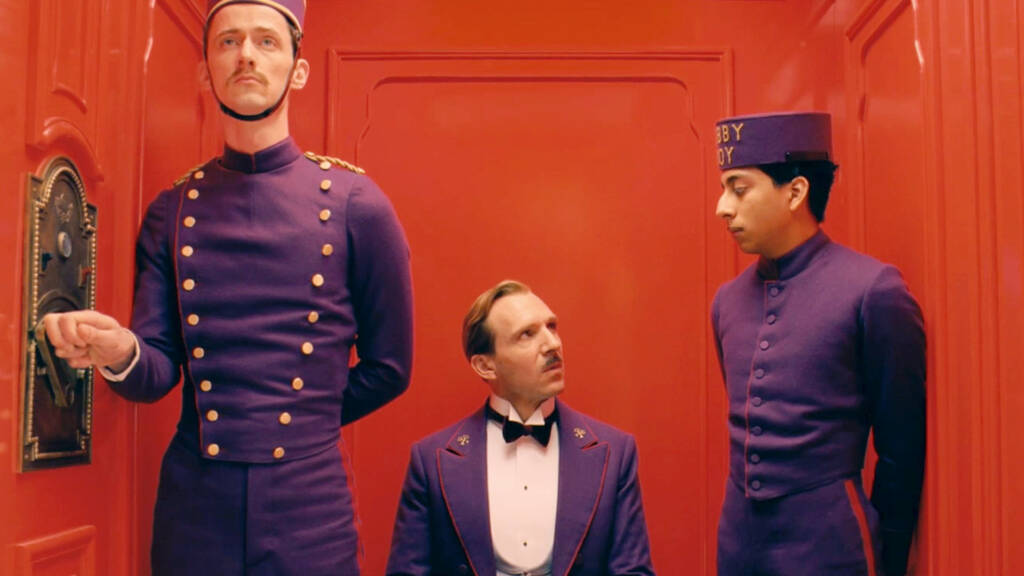
Wes Anderson – The Grand Budapest Hotel
SEITZ, M. Z. (2015) The Wes Anderson Collection: The Grand Budapest Hotel. New York: Abrams Books.
When The Grand Budapest Hotel was released, film critics instantly fell in love with its intensely stylized, pastel-hued universe. However, looking at the reviews through the lens of my own research, what is most fascinating is how many major critics singled out the micro-level graphic design for praise. Critics writing for The New York Times and The Guardian noted that the fictional land of Zubrowka feels completely real because its physical environment is so meticulously constructed.
The film relies heavily on physical, printed props, such as the iconic, pale-pink Mendl’s pastry boxes, custom-designed passports, and daily newspapers, to establish its alternate twentieth-century timeline. Critics pointed out that these objects do not just sit passively in the background; they actively guide the camera and the narrative forward.
“Anderson’s films are characterised by creating another world… a universe built out of elaborate miniatures, custom typographic layouts, and physical ephemera that render the imaginary completely tactile.”
The critical reception of the film highlights an interesting paradox. While the movie is openly eccentric, theatrical, and artificial, the audience completely surrenders to the narrative immersion because the physical details are executed with absolute, rigorous logic. Reviewers mentioned that even the briefest close-up of a document reveals hand-stamping, realistic ink weights, and era-appropriate textures. This attention to detail completely anchors the viewer’s suspension of disbelief.
For my research, The Grand Budapest Hotel provides a strong case study of graphic props contributing to a highly controlled fictional world. However, the film’s success cannot be attributed to its props alone. Its writing, performance, cinematography, sound, sets and graphic design work together. I can therefore analyse the props as one important part of its world-building without presenting them as proof of a direct causal relationship with immersion.
Review Two
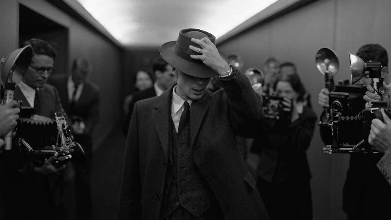
Christopher Nolan – Oppenheimer
POSS, J. M. (2023) Oppenheimer Film Review. Jordan M. Poss Blog, 31 July. Available at: https://www.jordanmposs.com/blog/2023/7/31/oppenheimer
Christopher Nolan’s Oppenheimer is widely celebrated for its commitment to practical filmmaking over computer-generated imagery. When looking through the mainstream reviews from Empire and various high-definition home cinema journals, critics repeatedly focused on the film’s overwhelming sense of historical realism.
To build the secret town of Los Alamos, the production design team did not just build structures; they populated the spaces with completely functional, period-accurate tools, military documents, and scientific ephemera. Reviewers noted that because Nolan utilised high-resolution IMAX 65mm film, the camera naturally captured the shallow depth of field and intense texture of the physical props.
“The devil is entirely in the details. The production design team populated the environments with spectacular, period-accurate props and a painstaking attention to absolute authenticity.”
Critics highlighted that the sheer material weight of the environment directly impacted the gravity of the story. When characters are handling top-secret government dossiers, calculations on textured paper, or stamped military orders, the physical presence of those objects communicates the immense stakes of the Manhattan Project without needing excessive dialogue. The reviews consistently state that the absolute tangible reality of the sets and props creates a deeply immersive envelope around the audience, pulling them directly into the mid-century timeline.
For my project, Oppenheimer offers an example of graphic objects working within a wider commitment to physical production design. Documents and scientific material help communicate period, authority and scale, but the reviews do not independently prove that physical paper or ink caused the audience’s immersion. The film is more useful as a visual case study than as experimental evidence.
Review Three
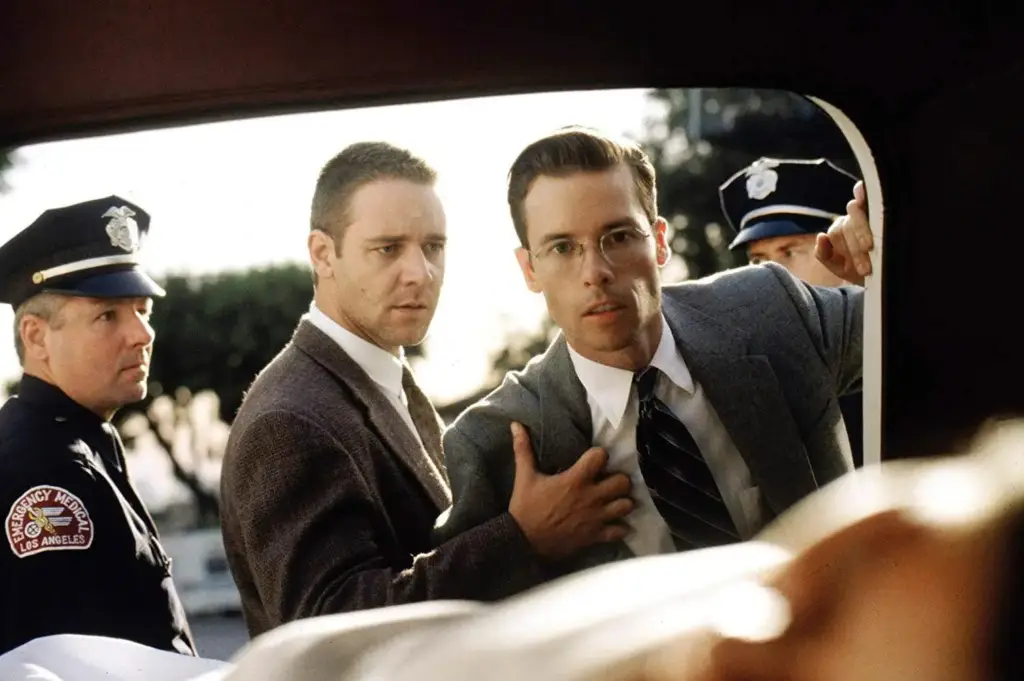
Curtis Hanson – L.A. Confidential
SIMONSON, M. (2001) Typecasting: The Use (and Misuse) of Period Typography in Movies. Mark Simonson Studio Notebook. Available at: https://www.marksimonson.com/notebook/view/typecasting/
While researching how typography can fail in cinema, I came across a classic typographic critique by typeface designer Mark Simonson regarding the 1997 neo-noir film L.A. Confidential. Set in the gritty, glamorous world of 1953 Los Angeles, the film is widely praised by mainstream critics for its incredible atmosphere, acting, and pacing. However, for graphic designers and typography enthusiasts, the film features a notorious typographic anachronism that acts as a major distraction. A central plot device in the movie is “Hush-Hush” magazine, a sleazy Hollywood gossip rag that characters are constantly reading on screen. The problem is the magazine’s bold masthead, which is set in Helvetica Compressed.
“L.A. Confidential is a highly regarded film, tightly written, well-acted, beautifully filmed, but pretty mediocre in its use of type. This one is set in the early ’50s, but the type was clearly not. ‘HUSH-HUSH,’ a Hollywood gossip magazine, is featured prominently sporting a logo set in Helvetica Compressed (1974).”
As Simonson points out, Helvetica was not even designed until 1957, and the specific compressed variant used on the prop was not released until 1974, over two decades after the film was set. In the early 1950s, a sensationalist gossip magazine logo would have been custom hand-lettered or set in a much more aggressive, wood type inspired sans serif. To the average viewer, a bold sans-serif font might just look “mid-century”. But to anyone with a basic graphic background, seeing a distinctly modern, Swiss-style modernist typeface in 1953 instantly creates a visual clash. It is a modern digital footprint stamped directly onto a historical setting.
Simonson’s critique demonstrates how specialist knowledge can make an anachronistic typeface particularly noticeable. It does not establish that every viewer experienced a break in immersion, but it shows why typeface history and production methods should be researched rather than relying only on whether a font appears vaguely ‘old’.
IMDb Goofs & Trivia
IMDb entries are contributed by users and may contain errors or assumptions about how a prop was made. I am therefore treating these examples as leads rather than confirmed evidence. Where an example becomes important to my argument, I will verify the typeface date, historical object or production detail through an independent source.
Item One
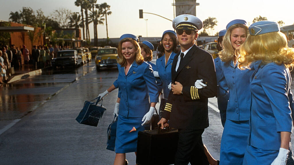
Steven Spielberg – Catch Me If You Can
For a film that is literally about a master document forger, you would think the art department would be absolutely bulletproof. But even Steven Spielberg’s team fell into a classic chronological trap. In the scenes set in June 1964, we see close-ups of the cheques Frank Abagnale Jr. is forging. At the bottom of these cheques, the routing numbers are printed in the iconic, retro-looking OCR-A font. The issue is that OCR-A was not actually developed by the American National Standards Institute until 1968. Using it in 1964 is a four-year chronological leap.
IMDb Goof: “The check numbers and routing codes at the bottom of Frank’s checks are printed in the OCR-A font. This font was not developed until 1968, yet is seen on checks dated 1964 and 1965.”
This is such a great example of what I call the “close enough” trap. To the average viewer, OCR-A looks like “old banking font” because we associate it with the early days of computer reading. But because the font is a digital-era staple, using it too early instantly leaves a modern fingerprint on a mid-century scene. For my own project, it shows that I cannot just grab any vintage-looking font from Adobe Fonts. If I want to be as accurate as possible, I’ll have to physically verify the release date of the typeface to make sure I am not creating an accidental timeline glitch. Although in reality I feel that time pressures sometimes add to the use of some of these errors, where something is needed that day for shooting, something that is ‘close enough’ is going to work for the majority of people.
Item Two
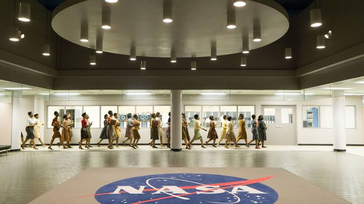
Theodore Melfi – Hidden Figures
Hidden Figures does a beautiful job of recreating the look of NASA and Virginia in 1961, but it completely trips up on its vehicle graphics. In the opening scene of the film, the characters are stranded on the side of the road with their car. When the state trooper pulls up, we get a clear view of the license plates on both vehicles. The plates feature a clean, blue, serifed typeface. However, real Virginia plates from 1961 used a very distinct, heavy, black blocky font with six numbers and a simple dash in the middle. The font shown in the movie is actually the standard typeface that Virginia only started using on their plates in the early 1990s.
IMDb Goof: “The license plates seen on the cars in 1961 use the blue serifed font that Virginia did not introduce until the early 1990s.”
This goof really highlights how “default” modern choices can slip past an art department. It is highly likely that they just ordered replica plates from a modern manufacturer who used their standard digital setup, rather than manually recreating the 1961 metal-stamping dies. It shows that immersion can be shattered by things we take for granted, like a license plate or a street sign. It reminds me that when I design my own ephemera, I cannot rely on modern production templates. Again, if I want accuracy in any designs I create, I’ll have to look at raw archive photos of the actual objects from the exact year.
Item Three
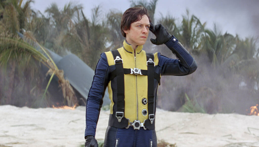
Matthew Vaughn – X-Men: First Class
Even though this is a superhero film, Matthew Vaughn goes to great lengths to ground the story in the authentic, retro-chic aesthetic of 1962. In one pivotal scene set in Argentina, Erik Lehnsherr (Magneto) is hunting down Nazis. He is shown a photograph of a boat from the 1940s, with the name of the vessel painted on the stern. The name of the boat is set in the majestic, classical typeface Trajan. The problem is that Trajan was designed by Carol Twombly for Adobe in 1989. Using a digital typeface designed in the late eighties on a physical boat from the nineteen-forties is a massive typographical error.
IMDb Goof: “The photograph of the German boat shown in the bar features the name of the vessel set in Trajan, a digital typeface that was not created until 1989.”
This is a classic case of what designers call “Trajan abuse.” Because Trajan is based on the stone-carved letters on Trajan’s Column in Rome, designers often use it as a shortcut for “anything old or classical.” But using a digital font from 1989 on a physical, hand-painted boat from WWII is a massive clash of technologies. Back then, the lettering on a boat stern would have been painted by hand using traditional sign-writing techniques and local block lettering. This goof is a massive warning to me: I must avoid using “historically inspired” modern fonts as a lazy shortcut. If I need a hand-painted or hand-carved look, I need to physically create it or trace authentic historical lettering.
Perception, Attention and the Limits of Prop Accuracy
After looking through examples of film mistakes and IMDb goofs, I wanted to investigate whether audiences actually notice these problems during normal viewing. It is easy to assume that an inaccurate prop will immediately break the illusion of a film, but research into visual attention suggests that it is not that simple.
Change Blindness in Motion Pictures
One particularly relevant study was carried out by Daniel Levin and Daniel Simons in 1997. Their research investigated whether viewers noticed continuity changes within short edited films.
In their first experiment, ten participants watched a conversation containing nine deliberate continuity mistakes. These included plates changing colour and objects or parts of the actors’ clothing moving between shots. During the first viewing, only one of the ninety possible changes was reported. Even when the viewers watched the film again and were specifically asked to look for mistakes, they noticed an average of only two out of the nine changes.
In a second experiment, the researchers replaced one of the central actors with a different person during a cut. Despite this being a major change to the main subject of the scene, only around a third of the participants noticed it.
This is quite a significant challenge to my initial assumption. If viewers can overlook a completely different actor, it seems unlikely that every incorrect typeface, piece of paperwork or background sign will automatically interrupt their immersion.
However, this study does not prove that prop accuracy is unimportant. The experiments used short and fairly simple films, with relatively small groups of participants. They also tested general continuity mistakes rather than historically inaccurate graphic props. What the research does demonstrate is that looking at something is not the same as consciously examining or remembering every part of it.
Editing Guides the Viewer’s Attention
Tim Smith and John Henderson developed this idea further through eye-tracking research into what they called “edit blindness”. Participants watched excerpts from seven feature films and were explicitly instructed to detect edits.
The viewers still missed approximately a quarter of the cuts made within the same scene. When a cut was disguised by a continuous movement or action, the number of missed edits rose to almost a third. This suggests that movement, performance and narrative action can guide the viewer’s attention away from quite noticeable visual changes.
Smith later proposed an Attentional Theory of Cinematic Continuity. His argument is that continuity editing works partly because it directs attention towards the information needed to understand the story. Viewers do not necessarily construct or remember a completely detailed version of the space around the characters.
This is important for my research because a prop sitting in the background may receive very little conscious attention. A prop that is handled by a character, shown in close-up or made important to the story is much more likely to be properly examined. Therefore, the placement and narrative use of a prop may be as important as the accuracy of its design.
(Smith and Henderson, 2008; Smith, 2012)
Expertise Changes What People Notice
Another study compared American football experts with people who knew much less about the sport. The researchers found that experts were better at noticing meaningful changes within football-related images. This advantage did not apply in the same way to unrelated images, suggesting that specialist knowledge affects which details a viewer recognises as important.
This may help to explain why designers, historians or people familiar with a particular period are more likely to notice an incorrect typeface or badly researched prop. A general audience may see an old-looking document, whereas a graphic designer might notice that its typography belongs to a completely different decade.
This also creates an interesting limitation within my own survey. Although 62% of my respondents did not work in the creative industries, I did not compare their individual answers against those of the respondents who did. A future version of the research could separate these groups to see whether specialist knowledge changed how frequently prop errors were noticed.
The football experiment cannot directly prove that graphic designers will spot more prop mistakes. However, it does provide evidence that familiarity with a subject can change how visual details are perceived.
Accuracy Is Not Always the Same as Authenticity
There is also a difference between something being historically accurate and something feeling authentic to an audience.
Dominic Lees argues that historical films often use recognisable “authenticity effects”. A completely accurate recreation of the past may still appear wrong if it conflicts with what audiences have learned to expect from other films, museums, photographs and popular culture. Production design therefore has to negotiate between historical evidence and a visual language that the audience understands.
This does not mean that accuracy should be abandoned. It suggests that believable production design is constructed from a mixture of research, consistency and familiar visual cues. A prop could be historically correct but still feel out of place if it clashes with the rest of the production.
A smaller audience study of three Ghanaian period films also found that inappropriate props could weaken the credibility of a historical setting and create confusion about the period being represented. This supports the argument that production design contributes to authenticity, while also showing that its effect is connected to the audience’s cultural knowledge and expectations.
What Does This Mean for My Research Question?
This research does not support the idea that every inaccurate background prop will be consciously noticed or cause an immediate break in immersion. Viewers can overlook surprisingly large changes when their attention is focused on character, action or story.
However, it also does not mean that prop design is irrelevant. The likelihood of a prop being noticed appears to increase when:
it is shown in close-up;
it is handled or discussed by a character;
it contains information needed to understand the story;
it is inconsistent with the surrounding production design;
or the viewer has specialist knowledge of the subject or historical period.
Tactile props may also contribute to the overall coherence of a scene without the audience consciously studying them. Their materials, wear, construction and interaction with light can help the setting feel convincing, even if the viewer cannot identify exactly why.
None of the studies I found directly compares a carefully constructed tactile graphic prop with a visually convincing but less materially resolved alternative. This means there is still a gap in the research. It is difficult to isolate the contribution of a single prop from cinematography, editing, performance, sound and the strength of the story around it.
My current conclusion is therefore more conditional than my original assumption. Tactile graphic props and period-informed ephemera can contribute to narrative immersion, particularly when they are visible, narratively relevant and consistent with the fictional world. However, their presence alone cannot create immersion, and an inaccurate prop does not automatically destroy it.
Narrative Theory Research
Theory One
Narrative Transportation — Green and Brock (2000)
GREEN, M.C. and BROCK, T.C. (2000) ‘The role of transportation in the persuasiveness of public narratives’, Journal of Personality and Social Psychology, 79(5), pp. 701–721. doi: 10.1037/0022-3514.79.5.701.
Green and Brock describe transportation as absorption in a story involving attention, emotion and mental imagery. Their studies examined how different levels of transportation affected story-related beliefs and evaluations.
“Transportation into a narrative world is an experience of cognitive, emotional, and imagery involvement in a narrative… Transported story-receivers are engrossed in a story in a way that is neither inherently critical nor involves great scrutiny.”
This gives me a useful framework for discussing audience engagement, but the study did not test graphic props or production design. I therefore cannot use it to claim that a carefully made prop will automatically transport an audience. Instead, I can consider whether coherent graphic details might support the wider conditions in which transportation occurs.
Theory Two
The Cognitive Mechanics of Suspension of Disbelief – Norman N. Holland 2009
HOLLAND, N. N. (2009) Literature and the Brain. Gainesville: PsyArt Foundation.
While the phrase “willing suspension of disbelief” was originally coined by the poet Samuel Taylor Coleridge in 1817, the psychological critic Norman Holland updated the concept using modern neuroscience and cognitive psychology. Holland explains that when we sit down to watch a motion picture, our brains consciously enter a purely “perceiving mode”. Because we know we cannot physically step through the screen to interact with the characters, our brain shuts down the neural pathways responsible for planning physical actions. Because we are not actively planning to move or protect ourselves, we stop assessing the “truth-value” of what we are seeing in real-time, allowing us to feel genuine, raw emotion toward things we know are completely fake.
“Neurally, when a person engages with a narrative in a work of fiction, the brain goes wholly into a perceiving mode… When the person stops perceiving to think about what has been seen or heard, its ‘truth-value’ is assessed.”
Holland’s account provides an interpretive way of thinking about the shift between experiencing a story and stopping to evaluate it. I need to use this carefully, as it does not demonstrate that a single inaccurate prop will always sever an audience’s emotional connection. For my project, it suggests that a noticeable inconsistency may prompt some viewers to reflect on the construction of the scene rather than simply following the story.
Theory Three
Epistemic Monitoring and Realism Judgments – Busselle & Bilandzic 2008
BUSSELLE, R. and BILANDZIC, H. (2008) ‘Fictionality and Perceived Realism in Experiencing Stories: A Model of Narrative Comprehension and Engagement’, Communication Theory, 18(2), pp. 255–280.
Busselle and Bilandzic present a theoretical model explaining how viewers construct mental representations of a story. They distinguish between external realism, which concerns consistency with knowledge of the real world, and narrative realism, which concerns coherence within the story itself.
Their article suggests that inconsistencies may interrupt comprehension, affect perceived realism or disrupt engagement. It does not claim that this will happen to every viewer, and it does not experimentally test graphic anachronisms specifically.
“Inconsistencies may interfere with comprehension and the construction of mental models… these inconsistencies may disrupt engagement, and may negatively influence post-exposure realism judgments.”
For my project, the model gives me a cautious way to discuss why an obviously misplaced graphic detail might become distracting. I can use ‘cognitive bump’ as my own informal shorthand, but I should not present it as the researchers’ scientific term or describe epistemic monitoring as a literal subconscious security guard.
Thoughts & Considerations
After looking through all of these articles, movies, reviews and theories, I wanted to distill everything I’ve found and learned into some considerations that I would take into own final project. These are:
Secondary Research Considerations
Test Physical Materiality: Physical paper, ink and surface wear can produce qualities that behave differently under light from simulated texture. I will test these qualities through making and photography rather than assuming that physical methods are always superior.
Research Typography in Context: Typeface dates, lettering methods and printing technologies can help establish period and place. IMDb and other public databases will only be used as starting points, with important examples verified through stronger sources.
Design for the Intended Encounter: A prop may need to work through a close camera lens, in an actor’s hand or as distant background dressing. Its materials and level of detail should respond to how it will actually be encountered.
Treat Immersion as a Wider Process: Graphic props may support narrative transportation and perceived realism, but they operate alongside story, performance, sound, cinematography and production design.
Maintain Internal Coherence: A fictional or stylised world does not need to reproduce history exactly, but its visual decisions should feel intentional and consistent with its own rules.
Recognise the Limits of the Evidence: Practitioner books, reviews and online articles provide useful perspectives but do not establish a direct causal relationship between tactile props and audience immersion.
