Church Architectural Plans
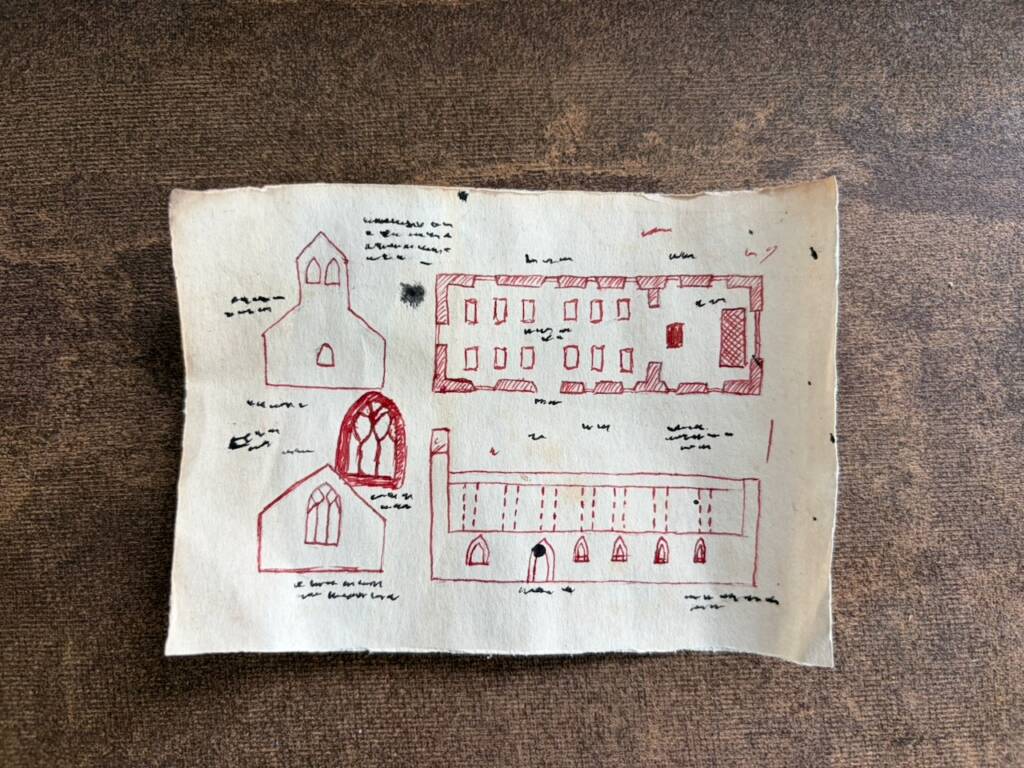
One of the hero props I wanted to create for this proposal was a set of architectural plans for the church. Within the proposed film, these would be handled by the monks during the construction scenes.
I began by researching surviving architectural drawings that could provide a visual reference. Because direct examples from medieval Isle of Man are extremely limited, I knew the finished prop would need to be historically informed rather than presented as an exact reconstruction.
Plan of St Gall
The strongest early reference I found was the Plan of St Gall, a ninth-century drawing showing an idealised Benedictine monastery. Its combination of architectural layouts and handwritten annotations gave me a useful starting point for the visual language of my prop.
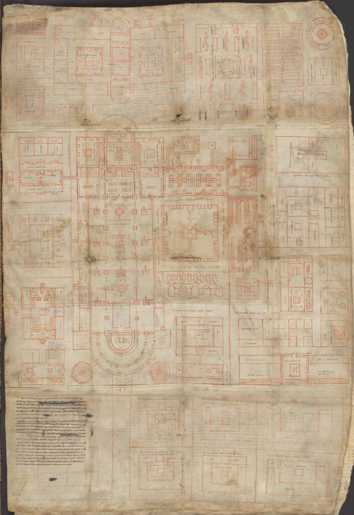
The plan uses brown and red lines, with extensive written annotations across the parchment. However, it predates the proposed setting of my story and comes from continental Europe, so it cannot show exactly how plans for St Trinian’s would have looked. I used it as a visual reference for layout, colour and materiality rather than as evidence of direct historical accuracy.
The original was produced on parchment. For practical reasons, I chose to use heavyweight paper and stain it with tea to create a similar colour and surface quality.
Sketchbook of Villard de Honnecourt
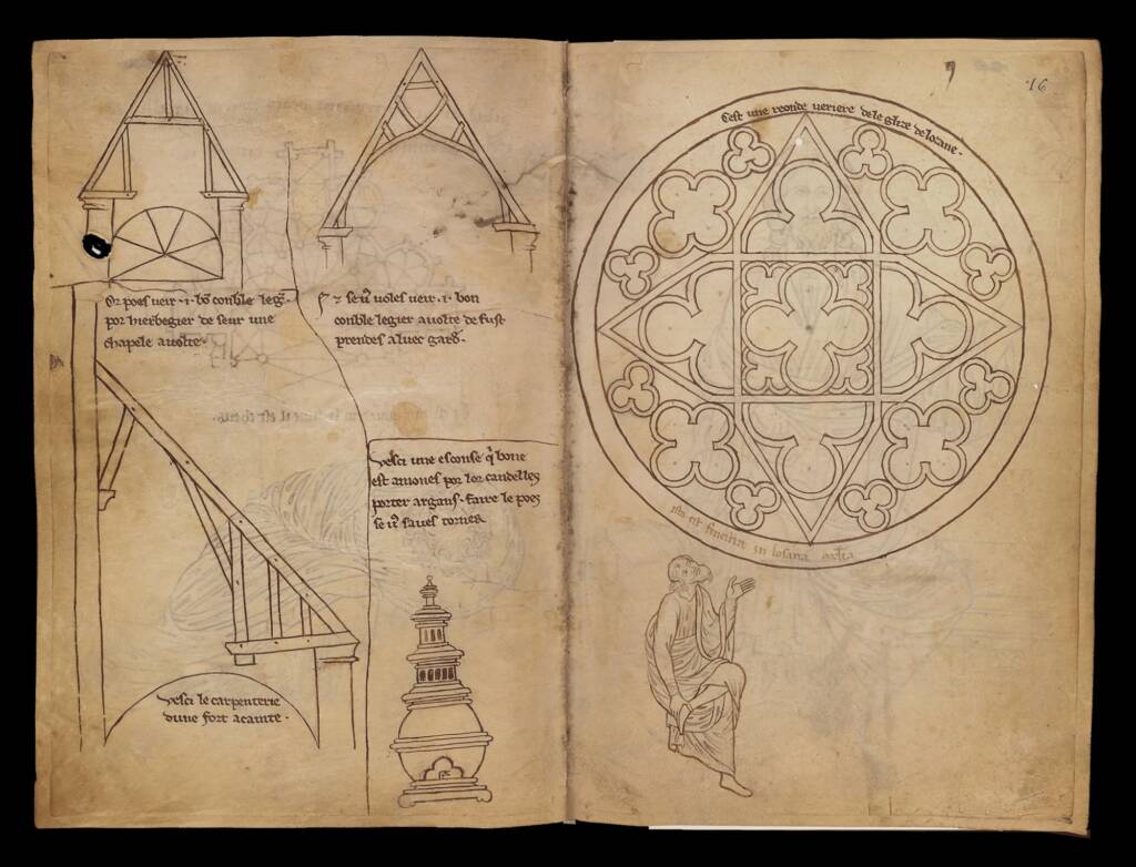
A second reference was the sketchbook of Villard de Honnecourt, produced during the thirteenth century. The surviving pages contain architectural sketches, diagrams, church details and written notes.
This material is later than the proposed setting of my story, so again it could not provide a completely period-accurate model. However, the window studies, geometric drawings and handwritten annotations offered useful visual references for the plans I wanted to create.
Production
My first thing to do in creating the church plans was to prepare my paper, I took some decent weight paper that wouldn’t disintegrate in water and bathed it in tea and warm water.
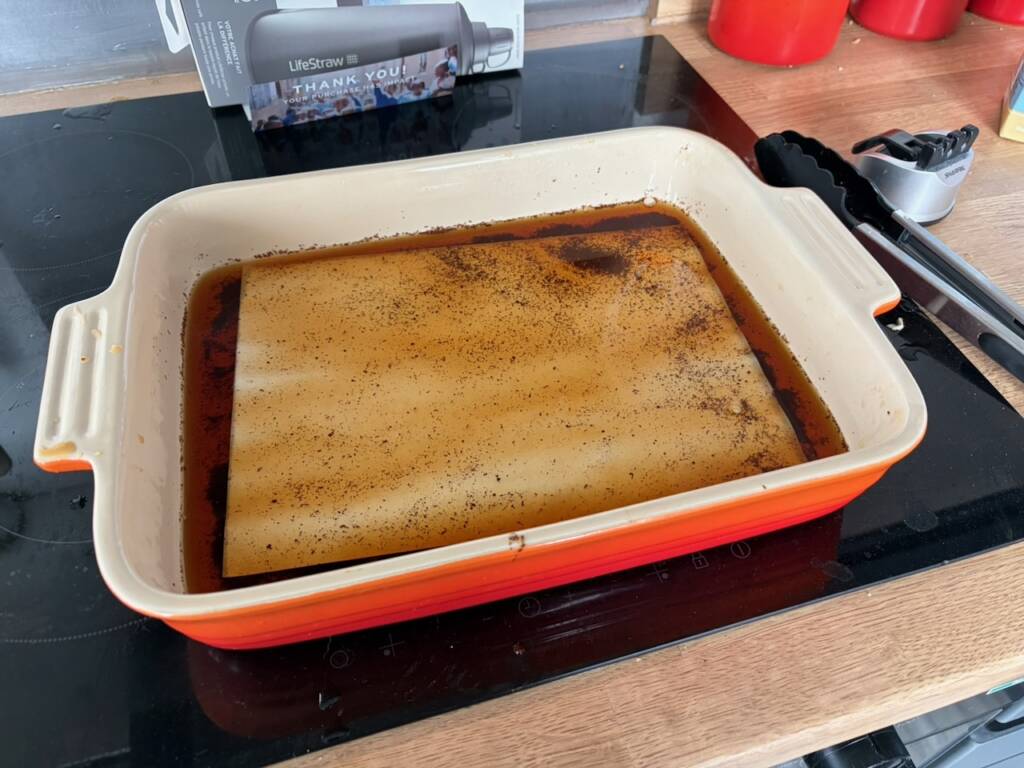
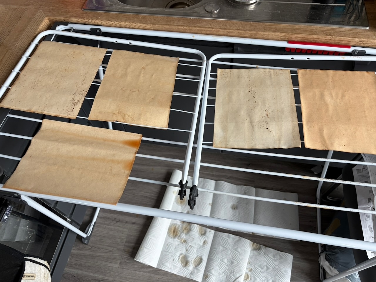
I left each sheet in the water bath for a different length of time, giving me several shades of aged paper to choose from. The surviving Plan of St Gall has darkened considerably over time, whereas my prop was intended to appear relatively new within the story. I therefore selected a lighter sheet rather than attempting to copy the present-day colour of the original manuscript exactly.
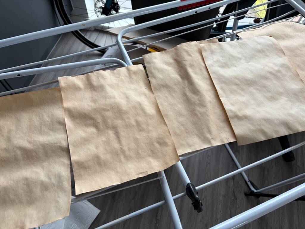
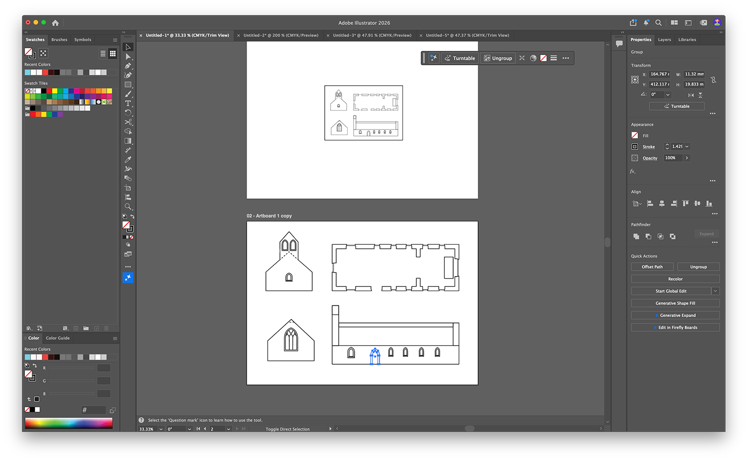
Once the paper was dry and the layout complete, I printed the design at the required prop size. Using a lightbox, I traced the main structure lightly in pencil before redrawing the plans with a quill and ink.
I used dark red for the architectural lines and black for the annotations, drawing on the visual contrast found in the Plan of St Gall. Some of the smaller writing became difficult to read at this scale. It still works as visual texture, although I recognise that the lack of legibility could become a problem during a close-up shot.
Once the ink had dried, I cut out the document and scraped the edges with the back of a craft knife. This removed the clean modern cut and made the paper feel more heavily handled. You can see the complete process in the video below.