

Before beginning the practical making, I wanted to establish a clearer understanding of how graphic props are approached by practitioners and perceived by viewers. My primary research combines two industry interviews with an exploratory audience survey. Together, these methods provide professional perspectives and self-reported audience responses, although they cannot establish a direct causal relationship between physical props and narrative immersion.
Industry Expert Interviews
I began by conducting two semi-structured interviews with working graphic designers. I used the same six core questions for both participants so that I could compare their experiences of materiality, historical research and production constraints. The questions were deliberately connected to my research interests, although several are strongly framed and may have encouraged agreement with my starting position.
Interview Questions
Question 1: “A lot of your work involves fine details that might only appear on screen for a split second or in the blurry background. Why is it vital to execute these props with genuine physical tactility (like correct paper stocks or manual ink distressing) rather than relying on quick digital fakes?”
Question 2: “In your experience on set, how much does the physical, tactile authenticity of a graphic prop impact the actors’ ability to immerse themselves in the world, even if the cinema audience never fully sees the item?”
Question 3: “When researching historical ephemera, how do you balance absolute period accuracy with the director’s specific aesthetic vision? Have you ever had to intentionally stretch historical accuracy to serve the overarching story?”
Question 4: “Designers often call graphic props an ‘invisible art’ because they are only noticed when they are wrong. In your opinion, what is the ‘breaking point’ where a typographic anachronism or a layout error completely shatters the illusion of a specific time period for the viewer?”
Question 5: “To what extent do you believe meticulously designed graphic ephemera actively drives narrative immersion, as opposed to simply serving as passive background set dressing?”
Question 6: “Can you recall a specific project where a single graphic artifact, like a map, a passport, or a letter, had to do the heavy lifting for the plot? How did the design choices directly influence the mood or storytelling of that scene?”
Because some of these questions use phrases such as ‘vital’, ‘quick digital fakes’ and ‘completely shatters the illusion’, they are not neutral. This is a limitation of the interview design and may have influenced how the participants framed their answers. I will therefore treat the interviews as practitioner perspectives rather than independent proof of my hypothesis.
Interview One – Flora Fricker
13th April 2026 – Interview Conducted via Email – Responses are verbatim – Flora has agreed for her name and answers to be displayed in my research and Critical Report
For my first interview, I spoke with Bristol-based graphic designer Flora Fricker, whose portfolio includes independent design work and graphics for film and television. Her experience of historically informed production offered a useful perspective on material construction, research and the balance between accuracy and a production’s visual direction.
Question 1: A lot of your work involves fine details that might only appear on screen for a split second or in the blurry background. Why is it vital to execute these props with genuine physical tactility (like correct paper stocks or manual ink distressing) rather than relying on quick digital fakes?
Flora: “It really comes down to the camera and the lighting. Modern high-definition cameras are incredibly unforgiving nowadays. If you use a standard digital print on crisp, white modern paper and just try to age it with a Photoshop filter, it looks flat.
The camera captures how light reflects off a surface, and light behaves very differently on a piece of vintage, textured rag paper compared to modern smooth stock. When you physically crease a letter, let ink bleed into the fibres, or use manual stamping, you are creating tiny, microscopic bits of three-dimensional texture. Even if that prop is just sitting on a desk in the background or is only on screen for a split second, those physical qualities catch the light naturally. If we relied on quick digital fakes, the background would lose its depth, and the entire set would start to look like a stage instead of a lived-in world. You just cannot cheat physics.”
Question 2: In your experience on set, how much does the physical, tactile authenticity of a graphic prop impact the actors’ ability to immerse themselves in the world, even if the cinema audience never fully sees the item?
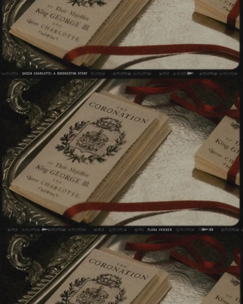
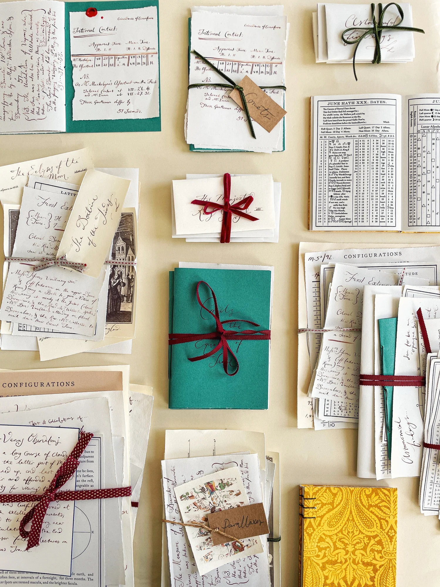
Flora: “Oh, it has a massive impact. Honestly, a lot of what we make in the art department is actually designed specifically for the actors and the directors, rather than the final viewer. When I was working on Queen Charlotte, I spent a lot of time creating King George’s letters, journals, and astronomy books. If an actor opens a leather-bound book on set and finds blank pages or modern printed text, the illusion is instantly broken for them. But if they open it and find beautiful, hand-written calligraphy on heavy, period-accurate paper, they immediately feel the weight of their character’s world. It changes how they physically handle the object, they turn the pages more deliberately, they hold it with more respect.
Their performance becomes more authentic because they aren’t having to pretend the object is real; it is real. We are essentially building a physical safety net for their performance. Obviously this varies from actor to actor, with some preferring more of their own immersion, whereas others are often fine with acting through a break in their own immersion. We usually try our best but often decisions have to be made (not by me thankfully!) on how much we’re going to physically create.”
Question 3: When researching historical ephemera, how do you balance absolute period accuracy with the director’s specific aesthetic vision? Have you ever had to intentionally stretch historical accuracy to serve the overarching story?
Flora: “This is a constant balancing act in the art department, and it can be quite tricky. Our first step is always rigorous historical research, but we have to remember that we are telling a story, not curating a museum. The director’s visual language and the story’s emotional tone always take priority. For example, on a highly stylized production, the color palette might be strictly controlled to evoke a specific mood. I might find a perfect historical reference for a piece of packaging from that exact year, but the original colors might clash horribly with the set decorator’s palette or the costume design. In those cases, you absolutely have to stretch the historical reality.
You adapt the colours or simplify the layout to fit the cinematic world. The key is to keep the typographic structure and printing techniques accurate to the era so that the item still feels completely authentic to the untrained eye, even if you have manipulated the design to serve the narrative. It is about believability rather than strict, pedantic accuracy.”
Question 4: Designers often call graphic props an ‘invisible art’ because they are only noticed when they are wrong. In your opinion, what is the ‘breaking point’ where a typographic anachronism or a layout error completely shatters the illusion of a specific time period for the viewer?
Flora: “The absolute breaking point is almost always typography. Fonts carry a huge amount of subconscious cultural and historical baggage. If you are watching a drama set in the Victorian era and a shop sign in the background is set in a modern, clean digital sans-serif, it acts like a massive visual siren. Even if the viewer isn’t a graphic designer and doesn’t know the name of the font, they will subconsciously sense that something is off. It registers as too clean, too perfect, or just completely out of place. Another big giveaway is layout and printing consistency.
Before the mid-twentieth century, printing was a highly physical, mechanical process with limitations. If a document has perfect, razor-sharp digital alignment and zero ink variations, it looks artificial. The illusion shatters the moment the hand of the modern computer becomes visible.”
Question 5: To what extent do you believe meticulously designed graphic ephemera actively drives narrative immersion, as opposed to simply serving as passive background set dressing?
Flora: “I believe it actively drives immersion by establishing the quiet, unspoken rules of the world. Good graphic props are silent storytellers. When a viewer looks at a scene, they are constantly scanning the environment to understand where and when they are, and what the social status of the characters is.
If a character picks up a beautifully designed, slightly worn train ticket, that single item immediately communicates a journey, a time period, and a level of care. It fills in the gaps of the script without a single line of dialogue being spoken. If the set dressing is passive, the world feels empty. But when the graphics are meticulously designed, they build an airtight envelope around the story. They make the fictional universe feel so rich and detailed that the viewer believes the world continues to exist even after the camera cuts away.”
Question 6: Can you recall a specific project where a single graphic artifact, like a map, a passport, or a letter, had to do the heavy lifting for the plot? How did the design choices directly influence the mood or storytelling of that scene?
Flora: “Letters are almost always the ultimate narrative device because they are so intensely personal. When we design correspondence that a character has to read on screen, every single choice matters. The handwriting has to reflect their personality and emotional state. Is it rushed and messy? Is it formal and precise? For Queen Charlotte, the letters and astronomical documents had to feel incredibly intimate. The weight of the ink, the texture of the paper, and the way a wax seal was applied all had to convey the romance, the history, and the pressure of their royal roles. If the letter looked like a prop, the audience would focus on the piece of paper rather than the emotion of the scene. By making the object completely flawless and authentic to the Regency period, the graphic design completely disappears, leaving only the raw narrative and the emotional connection between the characters.
I also remember a moment on this show, the shot called for a letter featuring the gorgeous handwriting style we’d chosen to go with, the only issue is that the script called for ‘The Queen’ (India Amarteifio) had to actually sign the bottom of the letter, now there was very little chance that India could accurately pen Queen Charlotte’s signature in the same style as the rest of the writing. Thankfully Tom, our Leader Graphic Designer on the show had the idea to work it so our calligrapher we’d brought in could stand in as a hand model just for this shot! It was a such a small thing that no one would ever know but it’s all I could think about when I watched the show on Netflix”
Thoughts
Flora’s answers provided useful support for testing typography and materials through practice, but they should not be treated as proof before those tests have taken place.
Typography: Her comments suggest that typography and layout can become noticeable when they conflict with the period or visual world. This supports comparing different approaches, although an interview alone cannot establish their effect on viewers.
The Actor’s Perspective: Flora described detailed props as potentially helping performers engage with a scene. This is a valuable professional observation, but its effect is likely to vary between actors and productions.
Material Prototyping: Her discussion of paper, ink, creases and reflected light gives me practical reasons to photograph physical experiments. The purpose of those experiments will be to observe what changes through the lens rather than confirm a predetermined result.
Interview Two – Thomas Love
16th May 2026 – Interview Conducted via WhatsApp – Responses are verbatim – Thomas has agreed for his name and answers to be displayed in my research and Critical Report
For the second interview, I spoke with graphic designer Thomas Love, whose portfolio includes graphic work for productions such as Doctor Who, Good Omens and Sherlock. His experience across science fiction, fantasy and contemporary settings provided a useful comparison with Flora’s historically focused work.
I asked Thomas the same six questions, allowing me to compare how the two designers approached materiality, legibility, genre and historical reference. Two interviews cannot represent the entire profession, but the similarities and differences provide useful qualitative themes for further investigation.
Question 1: A lot of your work involves fine details that might only appear on screen for a split second or in the blurry background. Why is it vital to execute these props with genuine physical tactility (like correct paper stocks or manual ink distressing) rather than relying on quick digital fakes?
Thomas Love: “Honestly, because the audience is smarter and more observant than we ever give them credit for. With 4K streaming and high-end home cinema setups, viewers are actively looking for details. They pause the screen, they screenshot things, and they dissect them on Reddit ten minutes after an episode drops. If you try to fake a physical texture digitally, it is incredibly obvious. When you print digitally, the ink sits perfectly flat on top of the paper. There is no bite, no pressure, and no imperfection. But when you use a real stamp, or you print on an old press, the ink actually sinks into the stock unevenly. That slight variance is what gives an object its soul. Even if it is just a background prop on a shelf, that tiny bit of physical depth stops the set from looking like a flat, painted backdrop. It grounds the scene in reality, even if that reality happens to be a spaceship or a fantasy realm.”
Question 2: In your experience on set, how much does the physical, tactile authenticity of a graphic prop impact the actors’ ability to immerse themselves in the world, even if the cinema audience never fully sees the item?
Thomas Love: “It is everything. People forget that actors are essentially playing make-believe in front of a giant green screen, surrounded by crew members, cameras, and hot lights. It is a highly unnatural environment. When you hand them a prop that is physically perfect, you are giving them a tether to the fictional world. If a character has to open a passport on screen, and the passport has the correct weight, the proper textured cover, and realistic security watermarks, the actor’s brain immediately clicks. They do not have to act like they are holding an important document; they can just react to it naturally. I have had actors come up to me on set just to thank me because a tiny bit of detail on a prop, like a realistic business card or a fully printed notebook, helped them find the gravity of a scene. It is about removing the friction of acting.”
Question 3: When researching historical ephemera, how do you balance absolute period accuracy with the director’s specific aesthetic vision? Have you ever had to intentionally stretch historical accuracy to serve the overarching story?
Thomas Love: “You stretch it all the time. Ultimately, we are designers for a narrative, not historians. Historical accuracy is our starting line, but it is rarely our finish line. The director’s vision and the script will always dictate the design. For example, in sci-fi or fantasy shows like Doctor Who or Good Omens, we are often blending real-world history with highly heightened, absurd, or futuristic elements. You might be designing a newspaper from the 1970s, but the headline needs to convey a highly specific, bizarre plot point that demands a massive, dramatic typeface that would never actually have been used on a front page back then. You have to make a choice: do you keep it strictly accurate to 1970s print standards, or do you make sure the viewer can read the plot-point instantly? You choose the story, every single time. The trick is keeping enough of the authentic texture and layout so that the feeling of the era remains intact.”
Question 4: Designers often call graphic props an ‘invisible art’ because they are only noticed when they are wrong. In your opinion, what is the ‘breaking point’ where a typographic anachronism or a layout error completely shatters the illusion of a specific time period for the viewer?
Thomas Love: “The breaking point is definitely the typographic tone of voice. Fonts are incredibly powerful because they carry instant, subconscious historical markers. If you use a font that is synonymous with the late 1990s in a show set during the First World War, the illusion is dead. Even if a viewer does not know anything about typography, their brain registers a clash. It feels like a glitch in the matrix. But it is not just the font itself; it is also how it is applied. Modern vector-perfect curves are a massive giveaway. Historical printing had physical limitations. Metal type wore down, ink bled, lines were never perfectly straight, and paper was never perfectly white. When a prop looks too clean, too sharp, and too digitally aligned, it looks fake. The breaking point is perfection. True historical design is wonderfully imperfect.”
Question 5: To what extent do you believe meticulously designed graphic ephemera actively drives narrative immersion, as opposed to simply serving as passive background set dressing?
Thomas Love: “I think it is the glue that holds the entire world-building together. Set dressing is great for establishing scale, but graphic design is what establishes the logic of a world. Think about a passport, a poster on a wall, or a bottle of medicine. Those things tell you about the laws, the politics, the culture, and the daily life of that fictional universe. If the graphics are passive or generic, the world feels thin, like a theme park. But when they are meticulously designed, they suggest a massive, living world that exists outside the frame of the camera. It convinces the viewer that this world has a history, an economy, and a bureaucracy that continues to function even when the characters leave the room. It turns a set into a real place.”
Question 6: Can you recall a specific project where a single graphic artifact, like a map, a passport, or a letter, had to do the heavy lifting for the plot? How did the design choices directly influence the mood or storytelling of that scene?
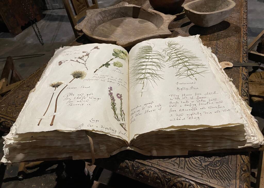
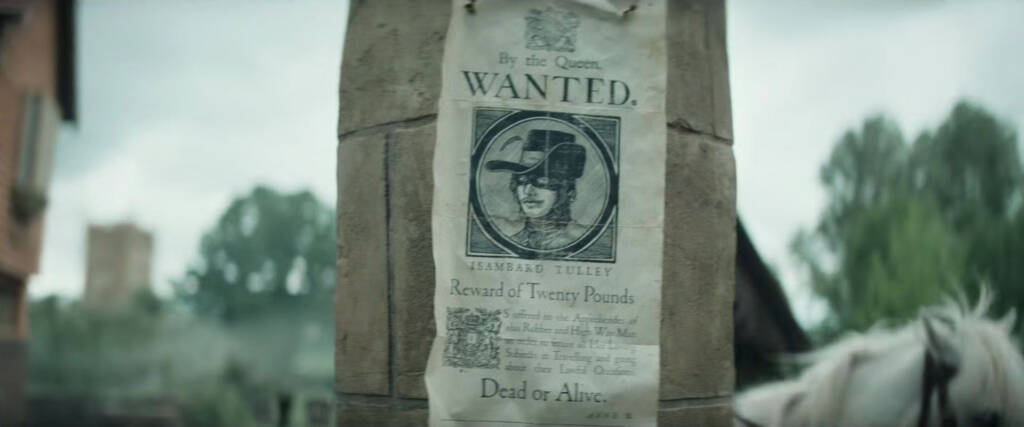
Thomas Love: “In shows like Sherlock, graphic design is practically a character because the plot is constantly driven by clues, documents, and visual information. When you have a prop that the camera is going to linger on in a massive, high-definition close-up, the design has to do an immense amount of work to set the tone.
I worked on a project where we had to design a highly confidential, vintage military dossier. The design choices had to communicate secrecy and high-stakes danger instantly. We used a heavy, textured manila folder, manually stamped ‘CLASSIFIED’ in a slightly faded, uneven red ink, and typewriter typeface with realistic ink smudges. We also physically aged the edges of the pages using tea staining and gentle sanding to show it had been handled for decades in secret archives. The physical weight of that folder, combined with the sterile, bureaucratic layout of the inner pages, immediately built tension before the actor even opened it. It sets the stakes visually.”
Reflection: The Contrast Between Flora and Thomas
The two interviews revealed several shared concerns, particularly the behaviour of materials under lighting, the relationship between props and performance, and the need to balance research with the requirements of the story. However, the agreement may partly reflect the leading wording of my questions and the related areas in which both participants work.
Flora’s responses concentrated more heavily on historically informed objects, while Thomas discussed legibility and world-building across different genres. Rather than treating one approach as more accurate, I can use the contrast to consider how the purpose of a prop changes between productions.
Thomas also raised the possibility of viewers pausing and examining details on high-resolution screens. This is a useful contemporary consideration, but it should not be generalised to every viewer without wider evidence.
Survey Strategy & Structure
The interviews provided qualitative practitioner perspectives, so I also designed a short Google Forms survey to collect self-reported responses from viewers. The questionnaire explored how often participants believed they noticed background graphics and how distracting they considered certain inaccuracies.
The six questions were designed to keep the survey short, but several prompt participants towards ideas already present in my research. The results should therefore be treated as exploratory attitudes rather than an objective test of immersion or cognitive processing.
Question 1: The Awareness Test (Multiple Choice)
The Question: When watching a film or television programme set in a specific historical period, how often do you actively notice background graphic details like newspapers, posters, or letters?
Options: Always / Often / Sometimes / Rarely / Never
Why I included this: This establishes how frequently respondents report noticing graphic details when specifically asked about historical film and television.
Question 2: The Anachronism Trigger (Likert Scale 1 to 5)
The Question: If you spot a historical inaccuracy in a graphic prop (for example, a modern digital font on a 1920s document), how much does it distract you from the narrative?
Options: 1 (It does not bother me at all) to 5 (It completely shatters the illusion of the scene).
Why I included this: This measures participants’ reported level of distraction. It does not directly test epistemic monitoring or observe an actual break in immersion.
Question 3: Physicality vs. Digital Polish (Multiple Choice)
The Question: Imagine a scene where a character is reading an old, handwritten letter. Which specific visual element makes that prop feel the most authentic and believable to you?
Options: The style of the handwriting or typography / The physical texture, creases, and aging of the paper / The way the actor handles the item / I do not usually notice these details.
Why I included this: This compares four prompted factors within a hypothetical scene. It does not directly compare a physical prop with a digital version.
Question 4: The Emotional Connection (Multiple Choice / Agreement Scale)
The Question: Do you agree with the following statement: “Highly detailed, realistic physical props help me connect emotionally with the world and the characters on screen.”
Options: Strongly Agree / Agree / Neutral / Disagree / Strongly Disagree
Why I included this: This records agreement with a positively worded statement. Because the wording encourages agreement, the result needs to be interpreted cautiously.
Question 5: The Recall Test (Short Open Text)
The Question: Can you recall a specific time when a prop or background graphic in a film really impressed you, or alternatively, completely took you out of the story? If so, what was it?
Options: Open text box (Optional).
Why I included this: This provides optional qualitative examples. The responses may offer useful illustrations, although people with particularly strong memories may be more likely to answer.
Question 6: Demographic Context (Multiple Choice)
The Question: Do you work or study within the creative, film, or design industries?
Options: Yes / No
Why I included this: This provides some context about the sample. It does not make the sample representative of the general population, and comparisons between groups would require cross-tabulation of the answers.
Survey Results
The survey received 72 responses. It was distributed through university networks, LinkedIn, film-related forums, friends and colleagues, with participants also invited to share it further. This produced a convenience and snowball sample rather than a representative sample of the wider public.
The results provide a useful indication of attitudes within this sample, but they should not be generalised to all viewers.
Here is the breakdown of the results and what they mean for my practical methodology.
Question 1: When watching a film or television programme set in a specific historical period, how often do you actively notice background graphic details like newspapers, posters, or letters?
- Sometimes: 44% (32 responses)
- Often: 29% (21 responses)
- Rarely: 18% (13 responses)
- Always: 6% (4 responses)
- Never: 3% (2 responses)
Reflection: A total of 57 respondents, or 79.2%, selected ‘sometimes’, ‘often’ or ‘always’. This indicates that background graphics were noticed to some degree by a substantial proportion of this sample when participants were prompted to think about historical film and television. It does not mean that they notice every prop or that graphic design is always consciously visible.
Question 2: If you spot a historical inaccuracy in a graphic prop (for example, a modern digital font on a 1920s document), how much does it distract you from the narrative?
- 3 (Noticeable but I can ignore it): 38% (27 responses)
- 4 (Highly distracting): 34% (25 responses)
- 5 (Completely shatters the illusion): 15% (11 responses)
- 2 (Barely bothers me): 10% (7 responses)
- 1 (Does not bother me at all): 3% (2 responses)
Reflection: Thirty-six respondents, exactly 50% of the sample, rated the distraction as either 4 or 5. This suggests that a prompted historical inaccuracy would be substantially distracting for half of these respondents. It supports investigating visual inconsistency, but it does not directly measure the cognitive process described by epistemic monitoring.
Question 3: Imagine a scene where a character is reading an old, handwritten letter. Which specific visual element makes that prop feel the most authentic and believable to you?
- The physical texture, creases, and aging of the paper: 48% (35 responses)
- The style of the handwriting or typography: 27% (19 responses)
- The way the actor handles the item: 16% (12 responses)
- I do not usually notice these details: 9% (6 responses)
Reflection: Physical texture and ageing was the most frequently selected option, chosen by 35 respondents, or 48.6%. This suggests that material appearance was important within the hypothetical example. However, the question did not show participants real physical and digital props, so it cannot confirm that physical distressing produces greater immersion.
Question 4: Do you agree with the following statement: “Highly detailed, realistic physical props help me connect emotionally with the world and the characters on screen.”
- Agree: 42% (30 responses)
- Neutral: 28% (20 responses)
- Strongly Agree: 19% (14 responses)
- Disagree: 8% (6 responses)
- Strongly Disagree: 3% (2 responses)
Reflection: Forty-four respondents, or 61.1%, agreed or strongly agreed with the statement. This indicates broadly positive attitudes towards detailed physical props within the sample. Because the statement was positively framed and based on self-report, it should not be treated as quantitative proof of narrative transportation or emotional causation.
Question 5: Can you recall a specific time when a prop or background graphic in a film really impressed you, or alternatively, completely took you out of the story? (Open Text) Out of the 72 respondents, 31 left a written comment. Here are three of the most useful quotes for my essay:
- “watched a bbc drama the other week and a shop sign looked like it was designed on powerpoint and then printed on shiny plastic. just looked so cheap really gave me a laugh that they left it in”
- “Grand budapest hotel has amazing props, the little boxes and passports make the fake country actually feel real.”
- “I hate it when characters write letters in 1800s shows and it looks like it was done with a biro. happens way too often.”
Reflection: Thirty-one respondents provided an optional written answer. These comments offer useful examples of the kinds of details viewers remember, but they are anecdotal and self-selecting. I can use a small number to illustrate themes while avoiding presenting them as representative evidence.
Question 6: Do you work or study within the creative, film, or design industries?
- No: 62% (45 responses)
- Yes: 38% (27 responses)
Reflection: Forty-five respondents, or 62.5%, stated that they did not work or study in the creative, film or design industries. This broadens the sample beyond trained designers, but it does not prove that the non-creative respondents experienced a cognitive bump. I would need to compare their answers with those of the creative participants before making that claim.
Primary Research Considerations
Bringing together the interviews and survey, I identified several principles to test through practice. These findings provide direction rather than proven rules, and their methodological limitations will need to remain visible in the Critical Report.
Test Typography Rather Than Assume Its Effect: Typography can communicate period and tone, but the research does not show that every viewer recognises anachronisms. I will use contextual references and evaluate the result through the wider design.
Use Physical Prototyping Purposefully: The interviews and survey responses give me reasons to test paper, ink, surface wear and lighting. Digital design can still form part of the workflow; the comparison concerns the finished physical qualities rather than rejecting digital tools.
Consider Lens, Scale and Handling: Props should be designed for how closely they will be photographed, how they relate to the puppets and whether they need to be handled or posed.
Allow Controlled Imperfection: Ink variation, worn surfaces and uneven construction may support the handmade visual direction, but ageing should be observed and controlled rather than added automatically.
Balance Research with Artistic Licence: Historical references provide a starting point, while the story may require deliberate departures. Those departures should be intentional and acknowledged.
Interpret Audience Evidence Carefully: The survey suggests that many respondents notice graphic details and can be distracted by inaccuracies. It does not establish that props alone create immersion or represent the views of every audience.
