Typography & Experimental Design
Following an official ADHD diagnosis in my early thirties, I wanted to explore how design could function as a tool for self-reflection. This project is not just a functional font, but an expression of how a condition feels, built from the ground up using my personal understanding of ADHD cognition.
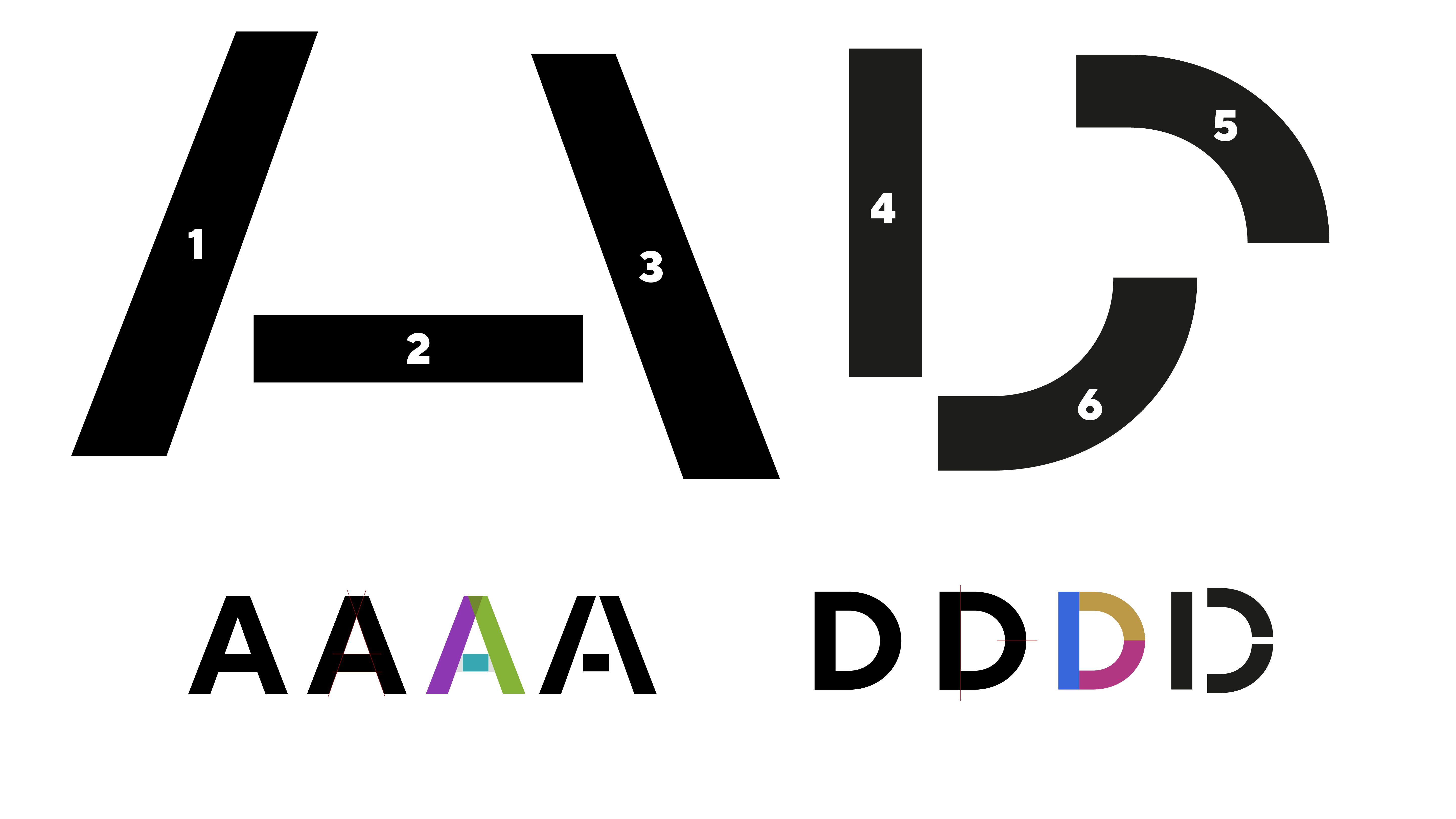
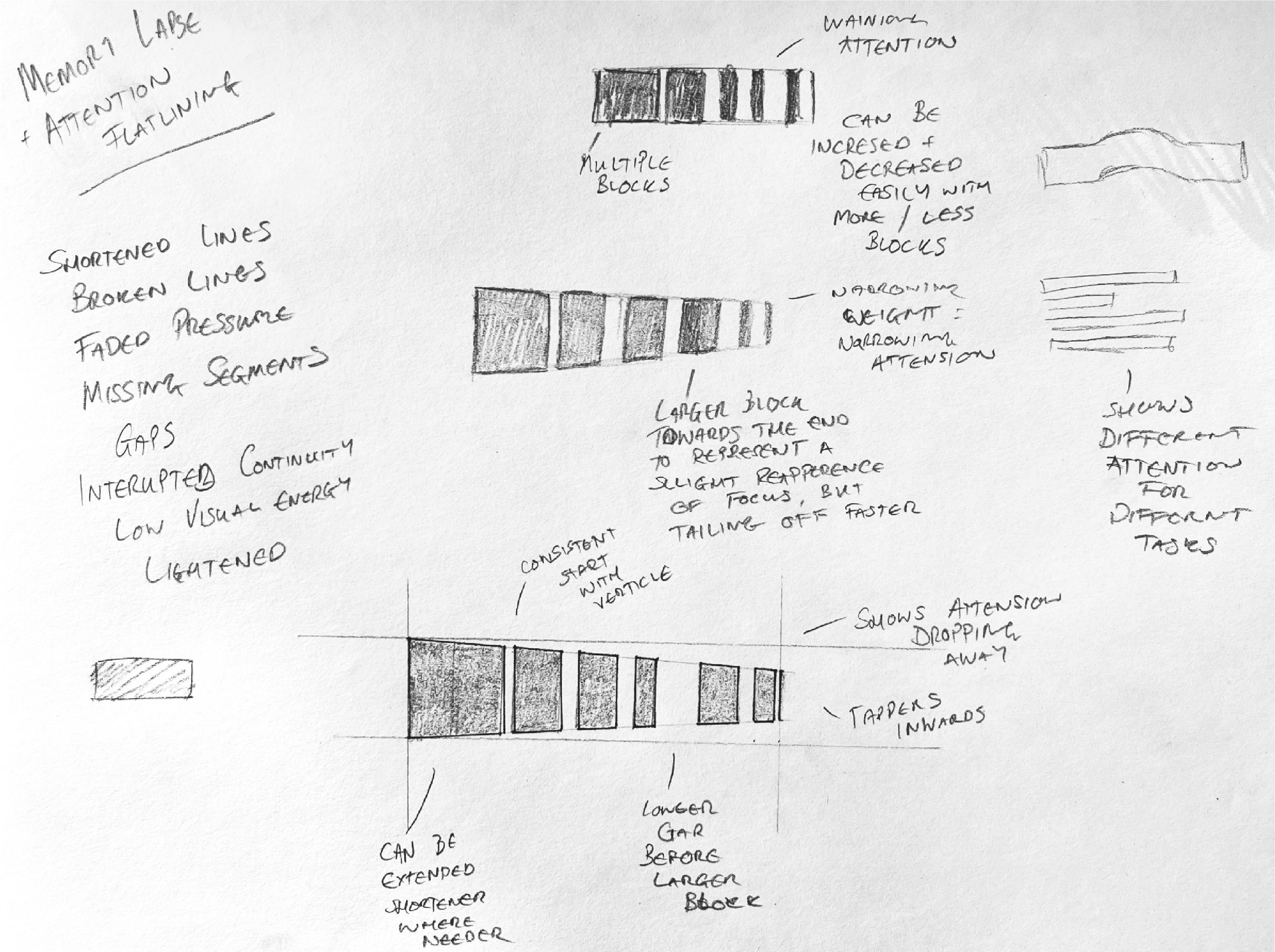
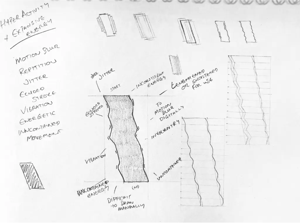
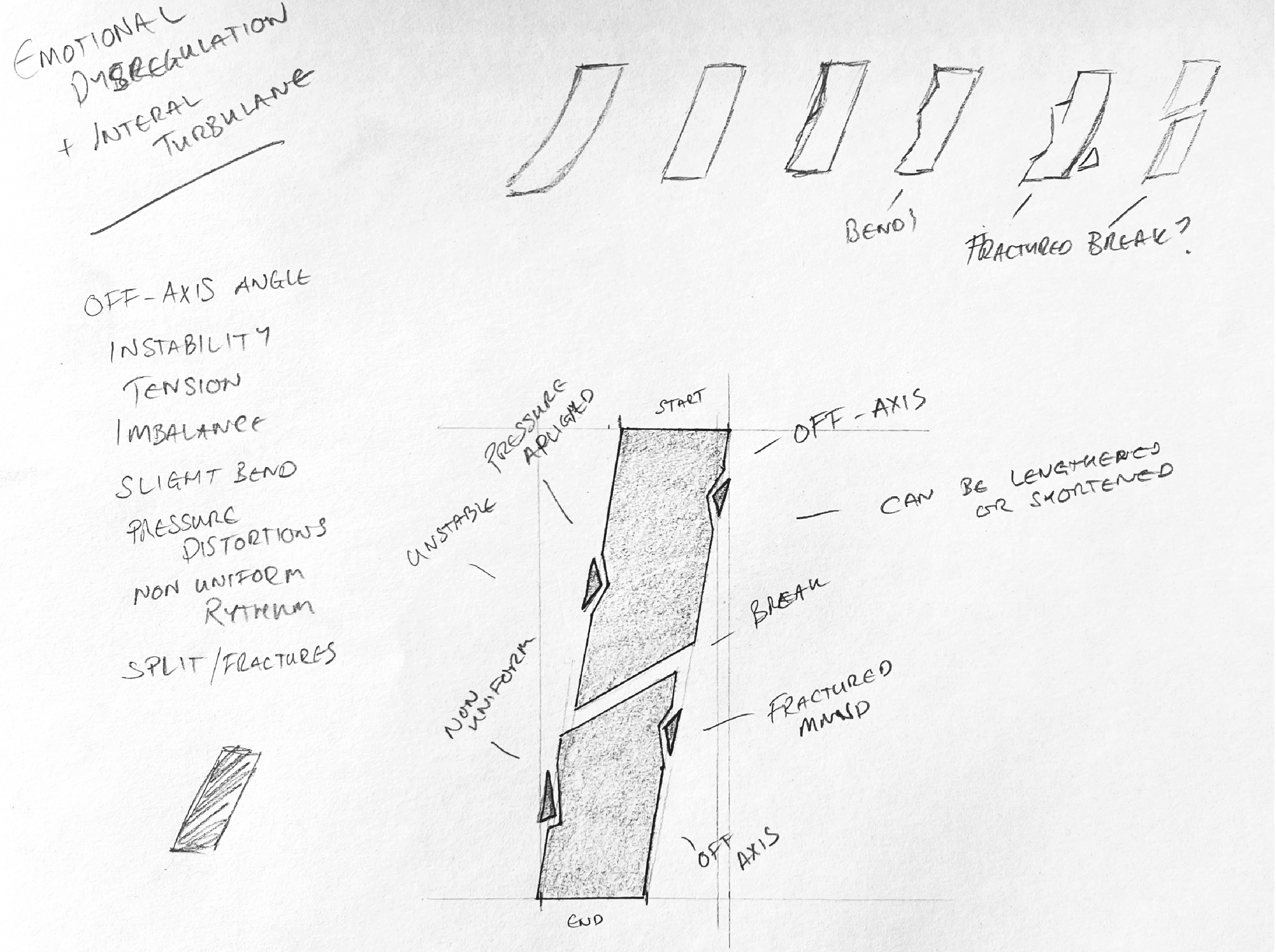
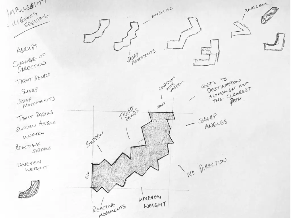
The Challenge: To reduce the Latin alphabet to its most basic components while assigning specific behavioural traits to each shape. This process mirrors the cognitive struggle of breaking down overwhelming tasks into manageable building blocks.
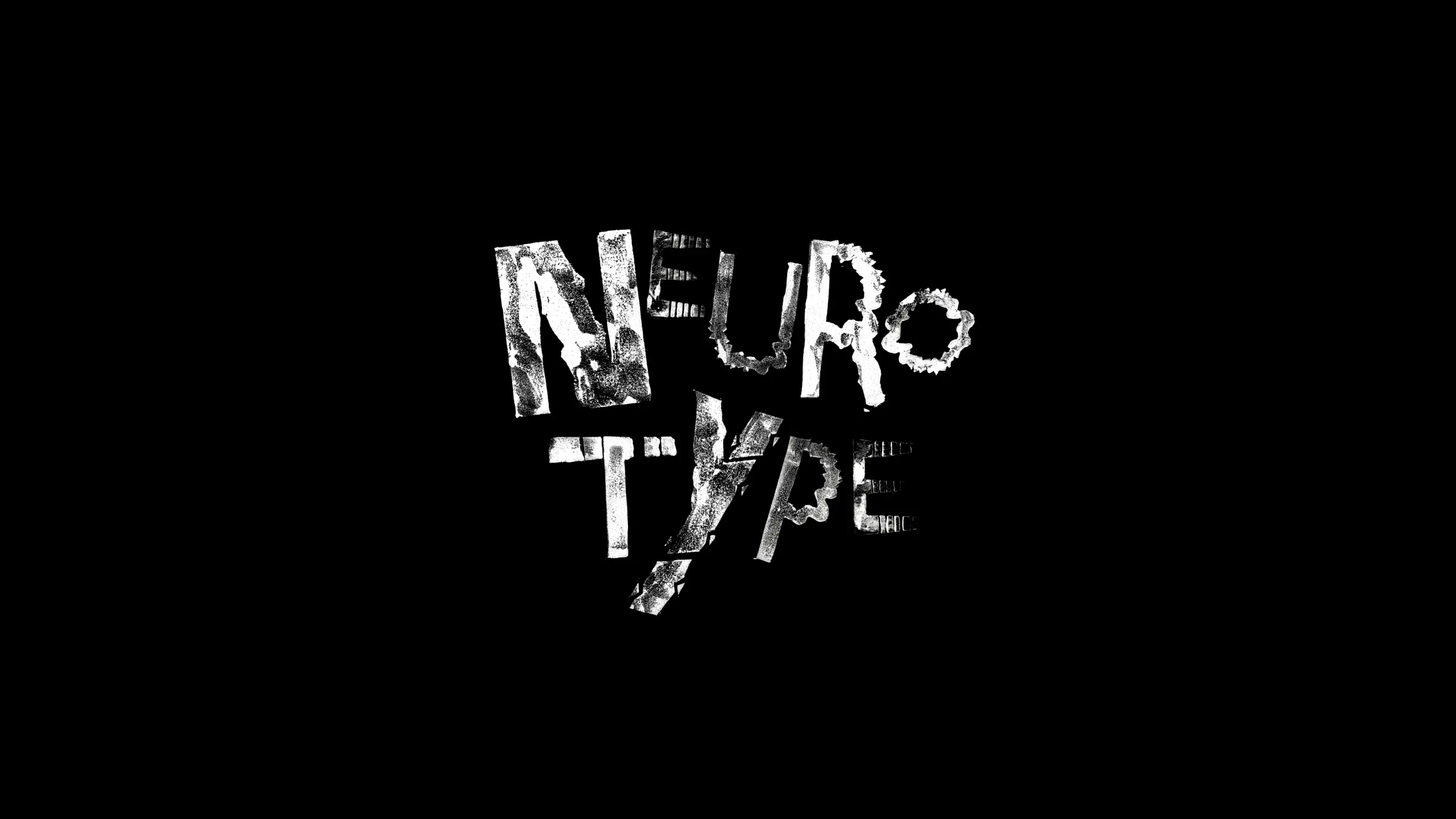
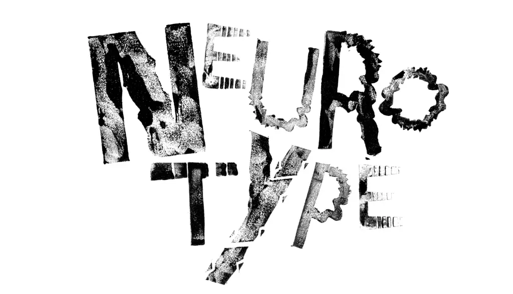
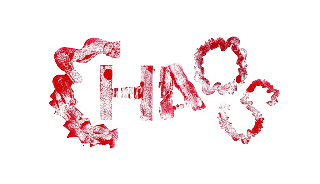
The Solution: I developed a system of six geometric shapes, each assigned to a core ADHD trait such as hyperfocus, impulsivity or memory lapses. By adapting and distorting these modules, I constructed a full alphabet that captures the tension between order and disorder. To add emotional weight, I translated these digital forms into physical lino stamps and collage, embracing the imperfections of ink and texture to reflect internal turbulence.


Lino Stamps
This project was produced as part of my MA in Graphic Design at Falmouth University. All research, design and physical making are my original work, created for academic and portfolio purposes.